
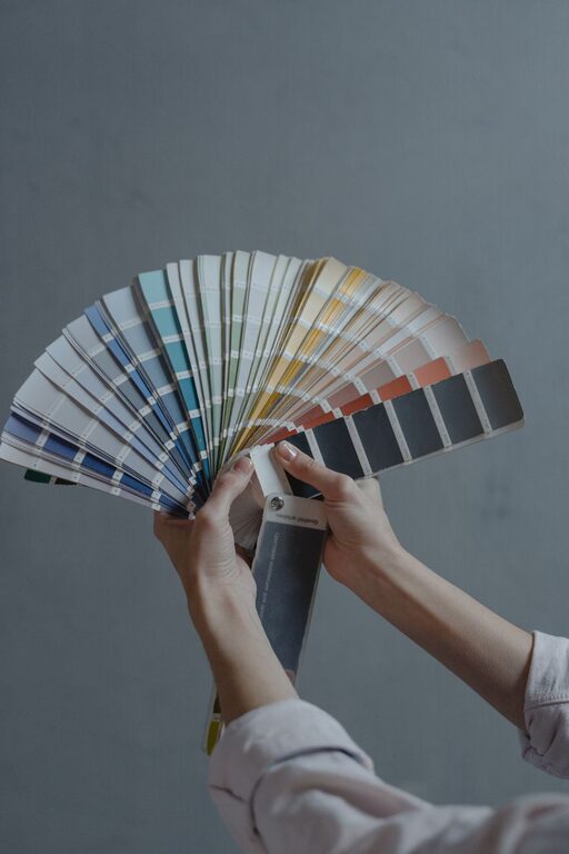
Creating a calm and peaceful environment in your home starts with the colors you choose for your walls and decor. Calm colors have the power to influence mood, reduce stress, and make your living spaces feel more inviting. Whether you want a serene bedroom, a tranquil living room, or a soothing office, selecting the right colors is key.
In this post, we’ll share practical tips to help you choose calm colors for your home that promote relaxation and comfort.
Why Choose Calm Colors?
Colors affect our emotions in subtle ways. Bright, intense colors like reds and oranges can energize or sometimes overstimulate, while softer, muted tones tend to have a calming effect. Calm colors help:
– Promote relaxation and restfulness
– Create a sense of spaciousness
– Reduce feelings of anxiety
– Encourage a peaceful atmosphere
Popular calm colors include soft blues, gentle greens, warm neutrals, and pale grays.
Tips for Choosing Calm Colors for Your Home
1. Understand the Psychology of Color
Different colors evoke different feelings. Here are some commonly calming colors and their associations:
– Blue: Often linked to tranquility and stability; great for bedrooms and bathrooms.
– Green: Represents nature and freshness; perfect for living areas and kitchens.
– Beige and Warm Neutrals: Provide warmth and comfort without overwhelming the senses.
– Soft Gray: Offers a clean, balanced look that works well in any room.
Knowing these basics can guide your color selection.
2. Consider the Room’s Purpose
Think about how you use each room. Calm colors in a bedroom may differ slightly from those in a workspace. For example:
– Bedrooms benefit from soft blues or greens to encourage sleep and relaxation.
– Living rooms might use warm neutrals with accents of calming tones to invite conversation and comfort.
– Home offices can feature muted blues or grays to maintain focus and reduce stress.
Tailor your color choices to suit the function of each space.
3. Test Colors with Samples
Paint colors can look different depending on lighting and surrounding elements. Always test samples on your walls before committing:
– Paint patches on each wall and observe them at different times of the day.
– View colors under natural and artificial light to see how they change.
– Compare how colors look alongside your furniture and flooring.
This practice helps prevent surprises and ensures your color choice truly feels calm.
4. Use a Monochromatic or Analogous Color Scheme
Restricting your palette can enhance calmness. Two effective schemes include:
– Monochromatic: Using different shades and tints of the same color creates a harmonious and soothing look.
– Analogous: Colors that are next to each other on the color wheel, such as blue, teal, and green, blend naturally and minimize visual tension.
These schemes create balance and make spaces feel restful.
5. Incorporate Texture and Natural Materials
Calm colors don’t have to mean flat or boring spaces. Adding texture and natural elements brings depth while maintaining tranquility:
– Use soft textiles like linen or cotton in calm colors.
– Add wooden furniture or décor for warmth and connection to nature.
– Include plants to enhance green tones and improve air quality.
These details enrich your space without overwhelming the senses.
6. Avoid Overly Dark or Sterile Colors
While some darker shades can be relaxing, too much darkness can make a room feel closed-in or gloomy. Similarly, very cool whites or grays might feel cold or uninviting if overused.
Aim for balanced tones that provide softness and warmth. For example:
– Choose warm gray over steel gray.
– Select off-white or cream rather than pure white.
This subtlety helps maintain calmness without sacrificing warmth.
7. Limit Bold Accents
Bold accents can add personality but should be used sparingly in calm spaces. A pop of color in décor, artwork, or throw pillows can:
– Prevent monotony
– Highlight features without overwhelming the room
Stick to muted or pastel accents rather than bright hues for the best calming effect.
Final Thoughts
Choosing calm colors for your home is a thoughtful process that involves understanding color psychology, assessing your space’s purpose, and experimenting with samples. By focusing on soft, natural hues and harmonious color combinations, you can transform your home into a peaceful retreat where you feel relaxed and refreshed every day.
Remember, calm colors work best when combined with comfortable furnishings, good lighting, and personal touches that make the space truly yours. Happy decorating!